Analysing the Use of Colors in Historical Prints and Drawings
-

-
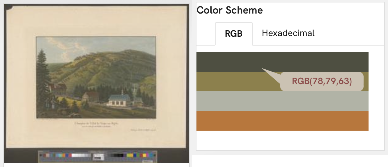
Fig. 1: Example of the colour scheme for one of the BSO images
In the Bilder der Schweiz Online project (BSO), we have the opportunity to work with a rich dataset of historical images of Switzerland. These images typically represent an array of artistic landscape depictions ranging from cities to mountains and green fields. They span all seasons, showing us a wealth of landscapes in different states. One of the main image attributes is the colour scheme. Colours represent a main attribute of images and through their analysis we can uncover information regarding the image. This is why we have designed a colour scheme extraction and analysis pipeline for BSO (fig. 1).
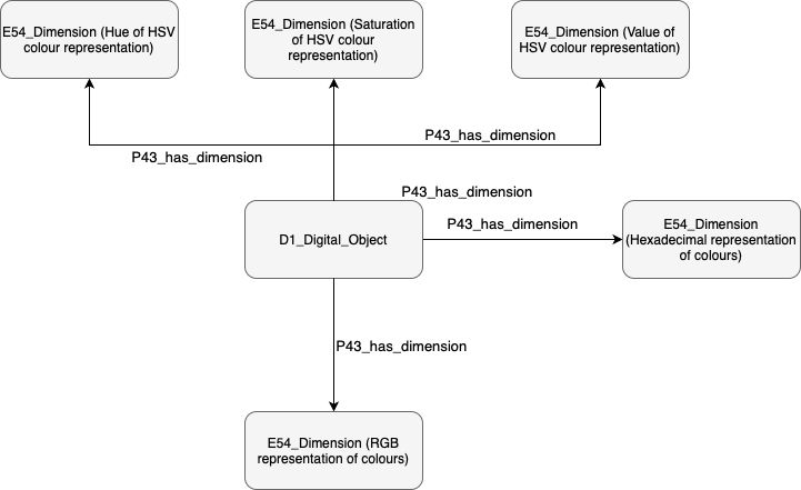
This colour scheme pipeline starts by extracting the main RGB colours of each image using the extcolors library. Given the significant size of the dataset, we used a cluster in order to get the results. The next step in this pipeline begs the question - how do we transform the extracted colour schemes into RDF data? In order to model the colour schemes, we added them to our triplestore as shown in the schema. As shown in fig. 2, we added E54_Dimension nodes for the RGB and the hexadecimal representations of colours. For the HSV representation, we added one dimension for each of the parameters hue, saturation and value. This was done in order to access the hue more easily as it is the closest measure to how humans perceive colours. In fact, this enabled us to code a browsing by colour feature where users can filter images based on the hues that they contain.
-

-
Fig. 2: Diagram showing how colour schemes were modeled (Source: SARI, CC-BY 4.0)
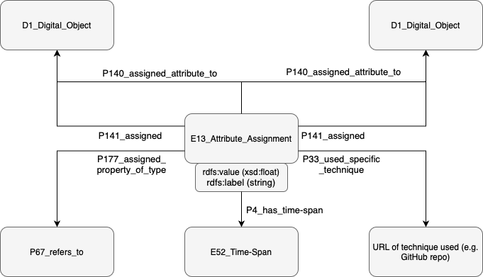
Having extracted the colour schemes from the images, one question that we wanted to answer was how similar images were with regard to their colours. Can we cluster them into groups? What possible interpretations could we then make when we survey these groups? In order to make answering such questions possible, we needed to devise a similarity or difference measure between images with regard to their colour. We did this by computing the difference between images in the CIE domain. This domain gives the difference between colours that is the most similar to human colour perception. After converting the image colours into the CIE domain, we computed the pairwise average colour difference between images. This gave us a distance matrix with average CIE distances between images. We modelled the distances as classifications. This is shown in the following diagram (fig. 3).
-

-
Fig. 3: Diagram showing how distances between images with regards to their colour schemes (Source: SARI, CC-BY 4.0)
Not only does this data enable us to enable features such as browsing with hues and showing similar images with regard to colour schemes, but it also helps us in answering some interesting research questions. By making it available through our SPARQL endpoint, we provide data to researchers so that they could answer questions such as:
- How did the use of certain colours evolve over time?
- Can we infer the season of the image using its colour schemes?
- Can we cluster images based on colour schemes? What groups do we then obtain?
- How diverse is the set of colours used for images in the BSO project?
- Are there artists that privileged certain colours compared to the rest?
Author: Andre Ghattas